
Find these elements in Library › Motion › Elements, section Social mockups. Click a tile to add it at the playhead, or drag it onto the timeline. Select the item on the timeline to change its options in the Inspector. Social mockups recreate familiar moments from social apps. They are generic designs: the phone and notifications show no real app names or logos. Most of them react at their cues, for example a like, a reply or a button press.

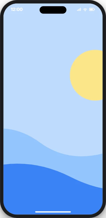
Phone

Phone element
A generic modern phone around an image or video screen; it can scroll a tall screenshot at its cue. Key options in the Inspector:
  • Screen: Picture on the screen: an image or a video (muted, looped).
  • Fit: Cover, contain, or scroll a tall screenshot.
  • Finish: Colour of the phone frame.
Ready-made tiles in the Library: Scrolling screenshot, Tilted, Light finish. When to use: App demos, website walkthroughs and showing a post.

Comment

Comment element
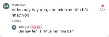
A short-video comment that gets a like and a creator reply at its cues, or the reply-to-comment sticker. Key options in the Inspector:
  • Look: Thread = a comment with a like and a reply; sticker = the reply-to-comment sticker.
  • Text: Comment text.
  • Show reply: The creator reply slides in at its cue.
Ready-made tiles in the Library: Dark comment, Reply sticker, Comment without reply. When to use: Answer a viewer question in a video.

Notifications

Notifications element
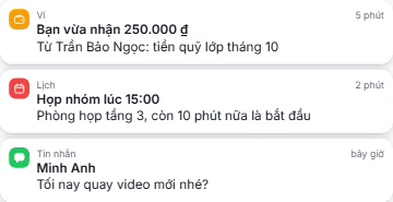
Push notification banners that pop in one by one, as a list or a stack. Key options in the Inspector:
  • Items: 1–6 notifications in the order they pop in.
  • Stack: List = every card in full; stacked = older cards peek out behind the newest.
  • Theme: Light, dark or frosted.
Ready-made tiles in the Library: Stacked, dark, Single banner, Frosted. When to use: Show sales, messages or alerts piling up.

Follow button

Follow button element
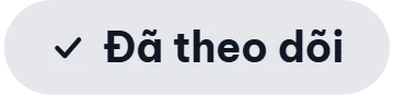
A follow or subscribe button pressed at its cue: it squashes, swaps colour and label, draws a check and can show a bell. Key options in the Inspector:
  • Label: Label before the press (up to 24 characters).
  • Pressed label: Label after the press.
  • Bell: After the press, a bell appears and wiggles.
Ready-made tiles in the Library: Subscribe with bell, Outline. When to use: End-of-video calls to follow or subscribe.

Floating hearts

Floating hearts element
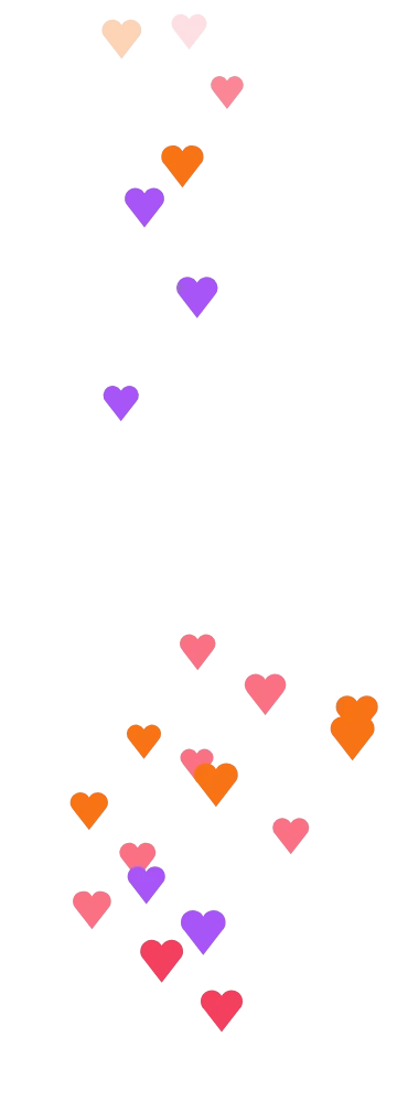
Livestream-style hearts rising from the bottom in a stream that loops exactly, with an optional burst at a cue. Key options in the Inspector:
  • Colors: 2–5 heart colours.
  • Rate: Hearts per second.
  • Burst count: Extra hearts at the burst cue (0 = no burst).
Ready-made tiles in the Library: Burst only, Brand colours. When to use: Livestream recaps, reactions and love-it moments.

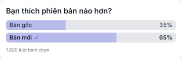
Poll results

Poll results element
A poll card with 2–4 options whose bars fill to their vote shares at the reveal cue; the winner gets a check. Key options in the Inspector:
  • Question: Poll question (up to 120 characters).
  • Options: 2–4 options with their votes.
  • Selected: The option the viewer voted for (ring and check); empty = no vote shown.
Ready-made tiles in the Library: Dark, Three options. When to use: Survey results and “what did people choose?” reveals.

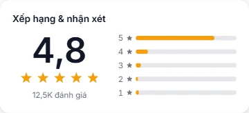
Star rating

Star rating element
A rating card where the score counts up while 5 stars fill, with the number of ratings and optional 5★ to 1★ bars. Key options in the Inspector:
  • Score: Score out of 5 (step 0.1).
  • Count: Number of ratings, shown short (12,5K).
  • Show distribution: Show the 5★ to 1★ bars beside the score.
Ready-made tiles in the Library: Compact, Dark. When to use: Product reviews, app ratings and testimonials.