
Find these elements in Library → Motion → Elements, section Brand & CTA. Click a tile to add it at the playhead, or drag it onto the timeline. Change its options in the Inspector. Logo, colour and font options can link to your Brand kit, so one brand change updates every element.

Logo reveal

Logo reveal element poster
Reveals your logo and name with a wipe, a blur, a drawn stroke or split halves, then the tagline, and closes the same way. Key options:
  • Logo: an image or the linked brand logo.
  • Style: the reveal, Mask wipe, Scale blur, Stroke draw or Split.
  • Tagline: the line under the name, shown at its cue. Leave it empty for none.
When to use: a branded intro or a short sign-off.

End screen

End screen element poster
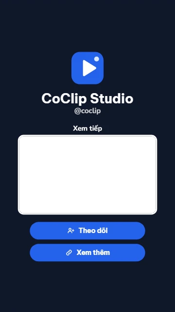
A full-frame end card with your logo, name and handle, up to three call-to-action pills and a framed opening for the next clip. Key options:
  • Pills: up to 3 call-to-action pills, each entering at its own cue.
  • Next video: leaves a framed opening for a clip on a lower track. It is a guide, not a media slot.
  • Handle: your handle or a short line under the name.
When to use: the last seconds of a video, to ask viewers to follow, subscribe or watch the next clip.

QR card

QR card element poster
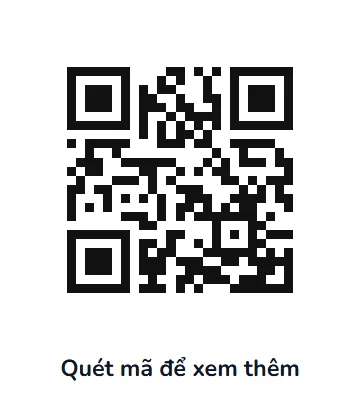
A scannable QR code card whose modules pop in, then hold with a caption and an optional centre logo. Key options:
  • Url: the link or text the code holds, up to 300 characters.
  • Caption: the line under the code. Leave it empty for none.
  • Show logo: puts the logo in the centre of the code.
When to use: sending viewers to a link, a shop or a sign-up page from a video.

Countdown

Countdown element poster
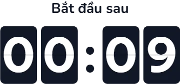
A countdown timer in flip cards, digital digits or a ring, exact to the frame. It holds 00:00 when done. Key options:
  • Mode: Fixed counts down from From seconds; Item end reaches 0 on the last frame of the item.
  • From: the number of seconds the count starts at.
  • Style: Digital, Flip or Ring.
When to use: “starting soon” screens, timed challenges and launches.

Chapter bar

Chapter bar element poster
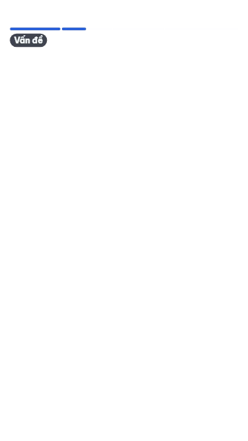
A progress bar split into chapters across the top or bottom of the frame. It fills with the item and names the active chapter. Key options:
  • Chapters: up to 12 chapters in order; each starts at its own cue.
  • Style: Segmented draws one bar per chapter; Line draws one thin line with chapter ticks.
  • Margin: the distance from the frame edge. Keep it clear of the platform’s buttons.
When to use: longer explainers where viewers should see where they are.